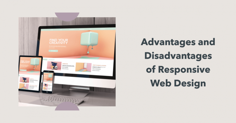
Responsive web design transforms how websites appear across devices. This approach creates sites that automatically adjust to different screen sizes, from desktop monitors to mobile phones. Understanding the pros and cons of responsive web design helps you make informed decisions about your website strategy.
Key Takeaways
- Responsive design automatically adjusts to all screen sizes, improving user experience
- It’s more cost-effective than maintaining separate mobile and desktop sites
- SEO benefits include better search engine rankings and no duplicate content issues
- Performance challenges can include slower load times on mobile devices
- Adaptive design offers an alternative with device-specific layouts
- The mobile-first approach works best for new responsive website projects
Understanding Responsive Web Design
Responsive web design is an approach that enables websites to adjust their layout according to the screen size. It utilizes CSS and media queries to adjust the appearance of content across different devices.
Unlike traditional website design with fixed layouts, responsive design flows. Text, images, and UI elements resize and reposition themselves automatically. This happens without creating separate versions for mobile and desktop users.
The core concept relies on flexible grids and layouts. These use relative units rather than fixed pixels. When a user switches from a laptop to a phone, the website adjusts instantly.
@media (max-width: 768px) {
  .content {
    width: 100%;
  }
}
This simple media query example demonstrates how CSS adjusts the content width for smaller screens. The layout changes when the screen width is less than 768 pixels.
Responsive Design vs Adaptive Design
Responsive and adaptive web design represent two different approaches to creating mobile-friendly websites. Each has unique characteristics.
Responsive design uses fluid grids and flexible images. The layout continuously adjusts to any screen size. It’s one website that works everywhere.
Adaptive site design creates multiple fixed layouts for specific screen sizes. The server detects the device and delivers the appropriate version. It’s like having several websites in one.
| Feature | Responsive Design | Adaptive Design |
|---|---|---|
| Layouts | One fluid layout | Multiple fixed layouts |
| Device detection | Client-side (CSS) | Server-side |
| Development | Single codebase | Multiple templates |
| Maintenance | Easier | More complex |
| Performance | Can be slower | Often faster |
Responsive works well for new websites. Adaptive might be better suited for updating existing websites or when performance is a top priority.
Pros of Responsive Web Design
Responsive web design offers several significant advantages for both website owners and users.
Improved user experience tops the list. Visitors receive a consistent experience, regardless of their device. This means higher engagement and lower bounce rates.
SEO benefits come next. Google rewards mobile-friendly sites with better search rankings. A responsive site avoids the duplicate content issues that can happen with separate mobile sites.
Maintaining one website instead of multiple versions saves time and money. You update content once, and it works everywhere. This streamlines your workflow.
Future-proofing is another advantage. As new devices with different screen sizes appear, your responsive site automatically adjusts. No need for redesigns with every new tech trend.
Analytics becomes simpler, too. You track user behavior across all devices in one place. This provides you with more comprehensive data on how people use your site.
Cons of Responsive Web Design
Despite its benefits, responsive design isn’t perfect for every situation. Several challenges exist.
Slower load times can be an issue. Responsive sites send the duplicate content to all devices, even when it is unnecessary. This can affect mobile users with limited data plans.
Images present a particular challenge. They require careful optimization to function effectively across all screen sizes. Without proper techniques, they can look wrong or slow down your site.
Complex tables and layouts might not translate well to small screens. Some content requires a significant redesign for mobile viewing.
The web development process takes more planning and skill. Building a truly responsive site requires expertise in CSS and testing across many devices.
Converting existing websites can be challenging. Sometimes, starting from scratch makes more sense than trying to make an old site responsive.
Adaptive Web Design: An Alternative Approach
Adaptive website design provides a distinct solution for multi-device compatibility. This approach generates multiple layouts tailored to specific screen sizes.
The server detects the visitor’s device and delivers the appropriate version. Standard breakpoints include desktop, tablet, and mobile phones. Each version is optimized for its target device.
Pros include:
- Faster load times on mobile devices
- More control over the user experience
- Better performance for complex interfaces
- Easier conversion of existing websites
The cons:
- Higher development and maintenance costs
- More complex analytics tracking
- Potential SEO issues with different content versions
- Less flexibility with unusual screen sizes
Some businesses choose a dedicated mobile site instead. This creates an entirely separate experience for mobile users, often with a distinct URL (such as m.example.com).
Tips for Creating Effective Responsive Websites
Successful responsive web design requires thoughtful planning and execution. Here are practical tips to help your project succeed.
Start with a mobile-first approach. Design for small screens first, then add complexity for larger screens. This forces you to focus on the most critical content.
Optimize images properly. Use modern formats like WebP and appropriate sizing. Consider using the srcset attribute to deliver different image sizes to different devices.
Keep navigation simple and accessible. Complex menus should collapse on mobile screens. Make sure buttons are large enough for touch interfaces.
Test continuously on real devices. Emulators help, but nothing beats seeing your site on actual phones and tablets. Pay attention to load times and touch interactions.
Several design tools can streamline the process:
- Bootstrap and Foundation for responsive frameworks
- Figma for creating responsive mockups
- Chrome DevTools for testing different screen sizes
- GTmetrix for performance testing
Focus on performance from the beginning. Mobile users expect fast-loading pages. Utilize lazy loading, code splitting, and other techniques to optimize performance.
Making the Right Choice for Your Website
Choosing between responsive and adaptive design depends on your specific needs and requirements. Consider your audience, budget, and existing website.
If most of your users access your site via mobile devices, prioritize the mobile experience. A responsive or mobile-first approach makes sense here.
For content-heavy sites, responsive design usually works well. News sites, blogs, and information portals benefit from its flexibility.
Sites with complex interactions may benefit from adaptive layouts. Online tools, dashboards, and e-commerce platforms sometimes need device-specific optimizations.
Your budget matters, too. Responsive design costs less upfront but might require more optimization later. Adaptive web design may initially incur higher costs, but it can perform better in specific situations.
Conclusion
Responsive web design offers clear benefits for most websites. Better SEO, improved user experience, and easier maintenance make it an attractive choice. However, the cons of responsive web design include potential performance issues and development challenges.
Carefully weigh these factors against your specific needs. For most new websites, responsive design provides the best balance of cost, performance, and future-proofing. Existing sites might benefit from adaptive approaches or dedicated mobile versions.
Whatever you choose, prioritize the user experience across all devices. Today’s web visitors expect websites to work flawlessly everywhere. Meeting that expectation should be your ultimate goal.